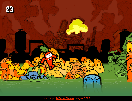
A hostile factory
Toxic fills its rooms with pipes, platforms, machinery, and glowing chemicals. The environment looks dangerous before anything moves. Strong silhouettes and sharp color differences help players understand which surfaces are safe and which demand caution.
Hazard as visual language
Bright liquid, warning stripes, and mechanical obstacles communicate function immediately. The art does more than establish mood. It organizes attention. In a platformer where timing matters, a dangerous object must be recognized before the player reaches it.
Movement through machinery
The hero is small compared with the surrounding equipment. That scale makes each room feel like a machine being crossed from the inside. Platforms become components, switches alter the system, and a successful route resembles a repair performed at full speed.
Mistakes stay understandable
When a jump fails, the reason is usually visible. The gap was too wide, the timing was late, or the hazard was approached from the wrong angle. Clear failure supports experimentation because players can form a better plan instead of guessing what the game expected.
Style through constraint
Toxic shows how limited screen space can strengthen an artistic direction. Repeated industrial shapes create cohesion, while a small palette gives hazards emphasis. The result is a world that feels oppressive and readable at once, turning visual design into a practical guide for survival.